Tiny exercises in design and typography from the middle of the 20th Century.
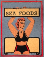 Sea Foods: In the universe of graphical matchbook covers, this represents one of the most primitive designs I've seen. Aside from the oddly proportion bather, the scroll behind her, the four dots along its bottom, and the barebones typography all combine to make this a masterpiece of a sort. |
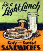 Tasty --- Toasted Sandwiches: This one is a classic restaurant design, notable as well for its combination of type styles. |
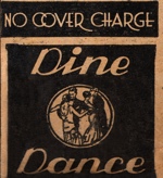 Dine Dance: I especially like the No Cover Charge type face. |
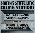 Smith's State Line Filling Stations: The type is classic pre-war while the maze-like pattern brings it all together in a wonderfully simplistic design exercise. |
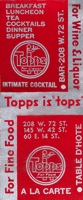 Topps: Another simplistically geometric design. |
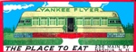 Yankee Flyer Diner: This is the one of the finest diner images I've ever seen. The proportions are classic, the building seems almost alive, and the background incongruously bucolic. |
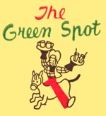 The Green Spot: The second letter in "Spot" makes it look awful close to something all too apporpriate for the color. |
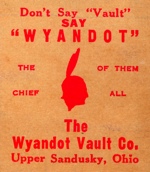 Wyandot Vault Co.: Undesign combines with a pair of unjustified analogies to make this cover memorable. |
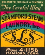 Stamford Steam Laundy: It's impressive to cram so much color, typographical variety and a great motto into such a small space. |
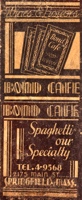 Bond Cafe: The logotype is nicely elaborate. |
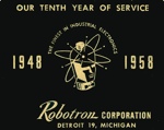 Robotron Corp.: If the name wasn't cool enough, the atomic robot image is classic. |
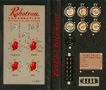 Robotron Corp.: A trompe l'oeil on this oversized cover. |
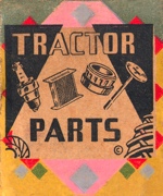 Tractor Parts: A geometric fantasia. |
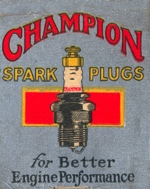 Champion Spark Plugs: As conservative as can be. |
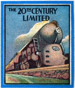 The 20th Century Limited: An archetype of streamlined modernism, though this is a pretty unmoderne representation. |
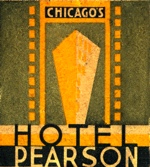 Hotel Pearson: Stylish and Deco. |
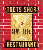 Toots Shor: Stylish. |
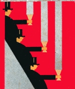 Top hats and goblets: The design exercise here way transcends the matchbook format. |
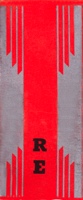 RE: More pure design. |
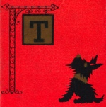
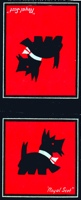 Royal Scot: Scotties were a favorite decoration for all kinds of mid-Century objects. |
 Scotties |
 Scotty |
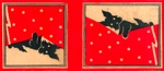 Sleeping Scotties |
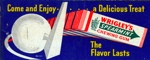 Wrigley's Spearmint Chewing Gum: The 1939 New York World's Fair, with its Trilon and Perisphere, set off a wave of elegant design. |
 Trilon and Perisphere: This is an especially subtle treatment. |
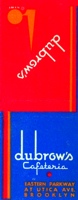 Dubrow's Cafeteria |
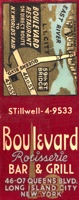 Boulevard Restaurant: Not so elegant, but the type faces are cool. |
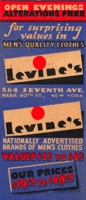 Levine's: Art Deco type and boisterous color. One imagines this is influenced by the World's Fair graphics. |
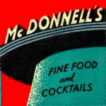 McDonnell's: Restaurant Moderne. |
 |
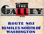 The Galley: Really fabulous logo treatment. |
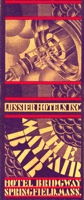 The Mayfair Bar: Over-the-top Art Deco from Springfield, Mass. |
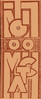 Lion Match Book: An exercise in pure typography. |
Grog N Groc |
Western Avenue Gallery |
Matchbooks
|
Motels
The Latest Stuff | Roadside art | Outsider pages | The idea barn | About | Home
Copyright Interesting Ideas 2008